I provided art direction for the refresh of Things Remembered’s e-commerce photography, adding consistency, and supportive imagery, as well as improving SEO product copy.
Category Page Example Before: Inconsistent styling, backgrounds, and crops.
Things Remembered’s e-commerce photography was out of date and a combination of 20+ years of direction changes that were never fully adjusted. This left a mix of photography styles, a lack of supportive imagery, and poor SEO product copy.
I partnered with cross-functional in-house teams to develop a new photography and styling guide that streamlined the lighting, styling, and propping. Bringing in the assistance of copy and SEO contractors and third-party photo studios, I kicked off the first round of legacy product reshoots and improved product SEO copy.
Example of a series of images to support a beer glass style.
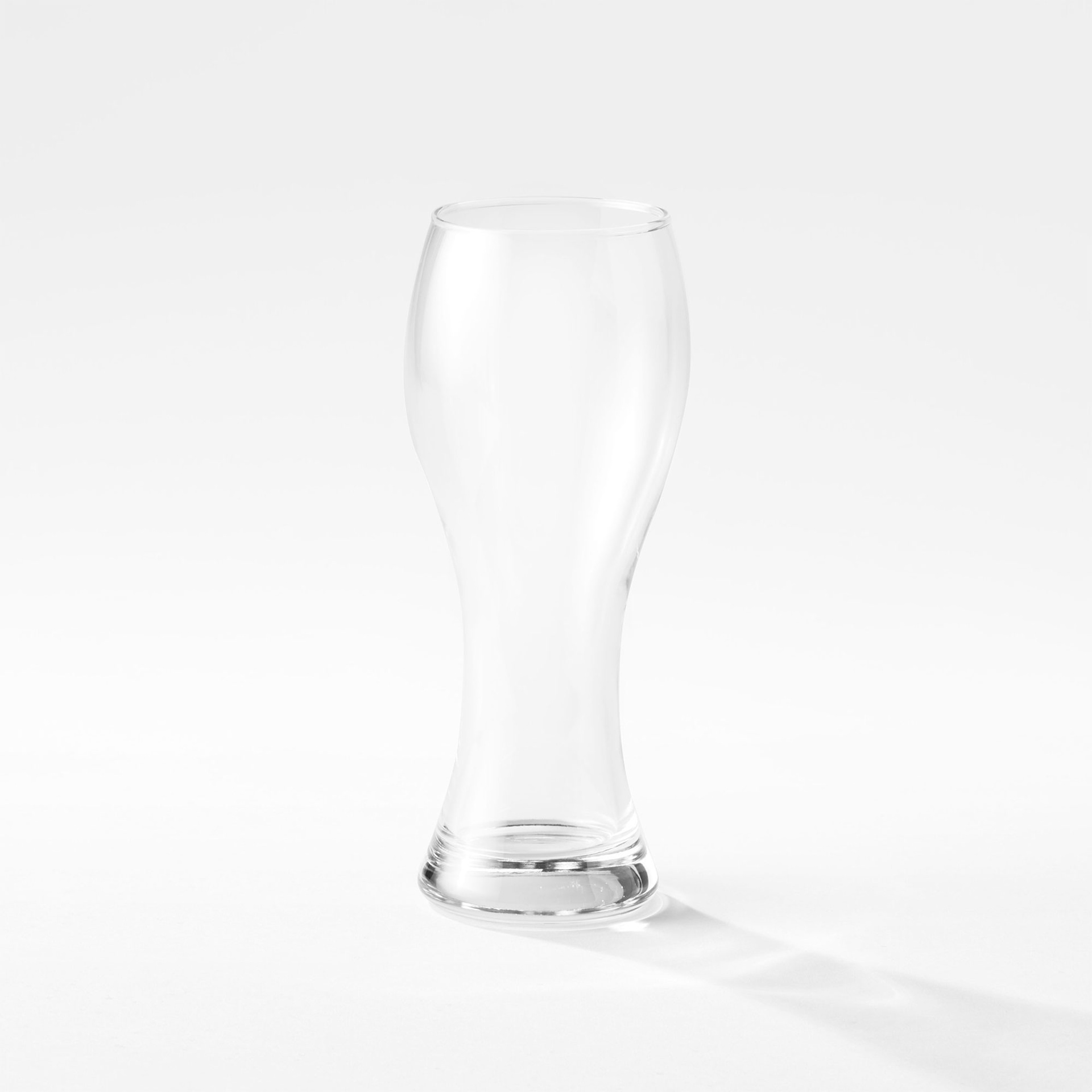
Showing product as is
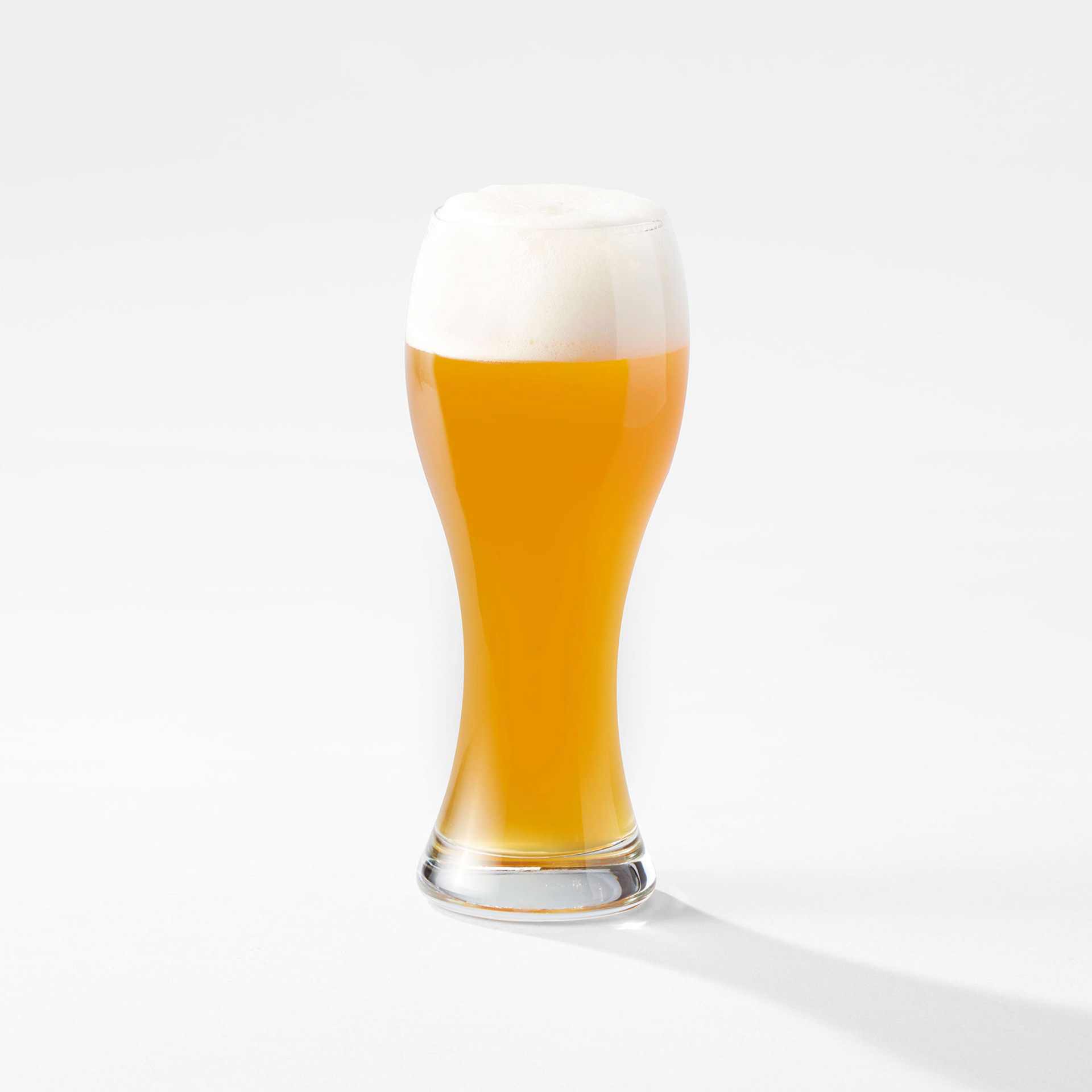
Showing use
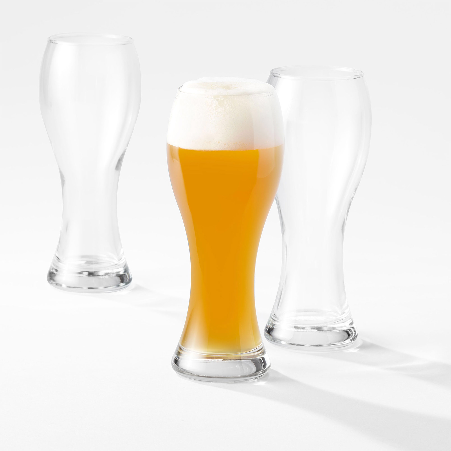
To encourage multiple purchases
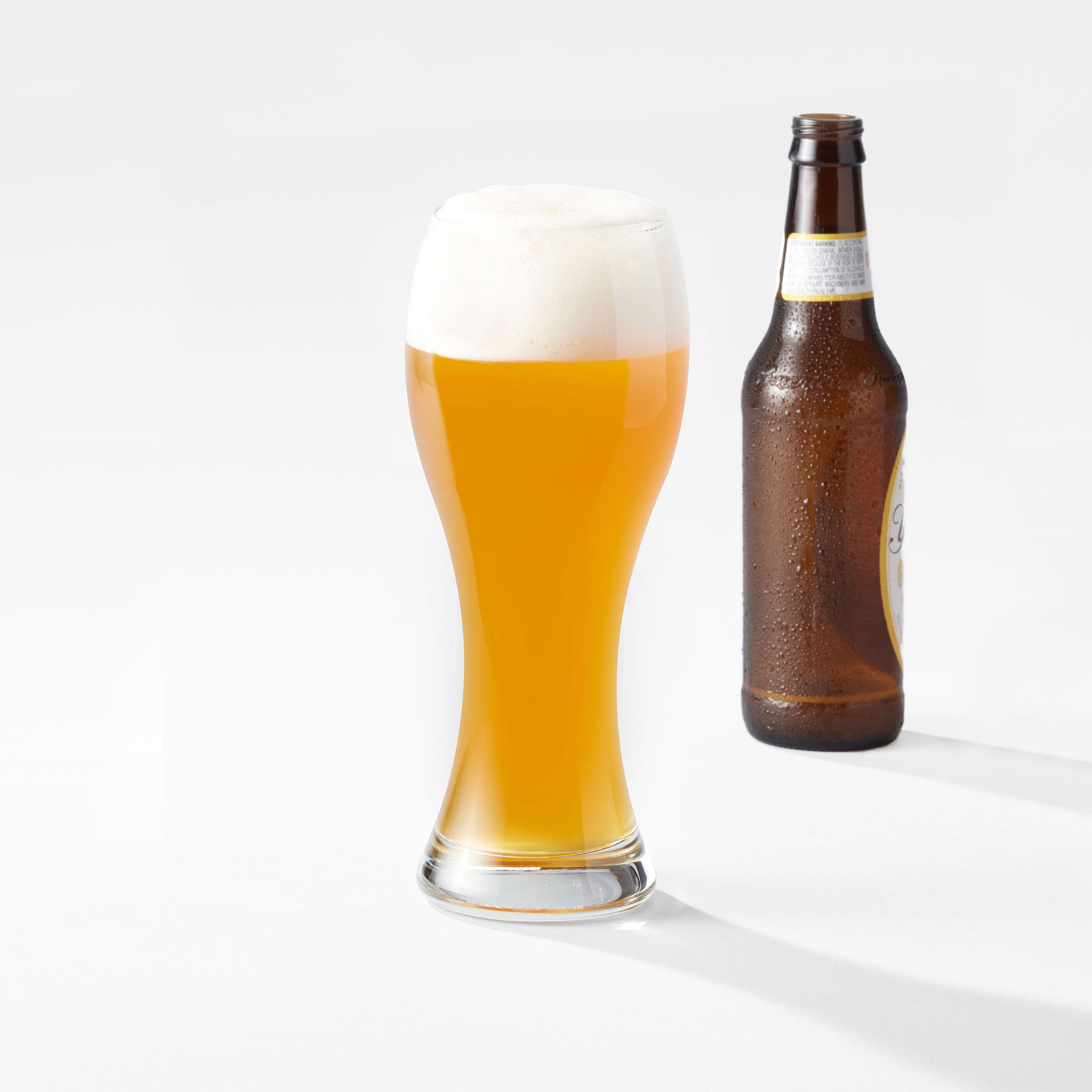
Showing scale
Before & After Examples
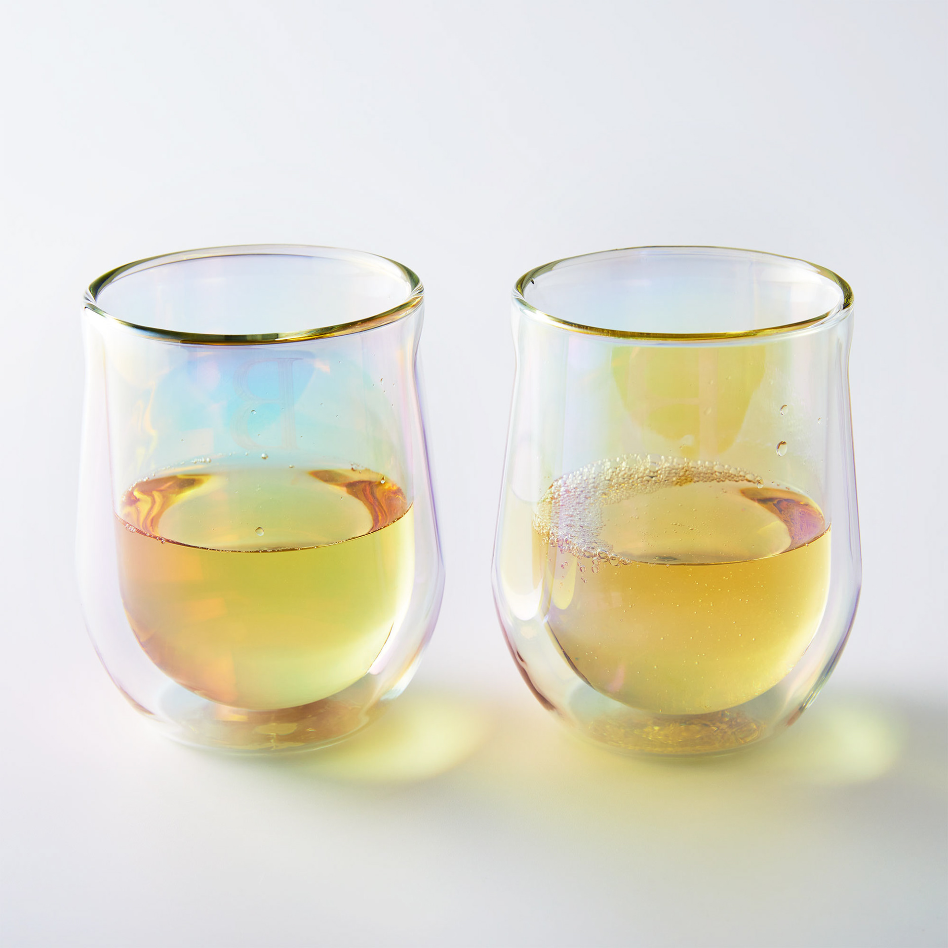
Before - harsh light, darker background, and liquid looks weird
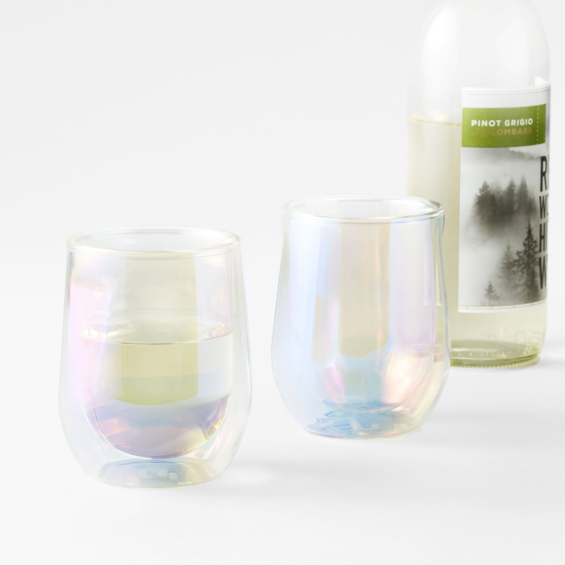
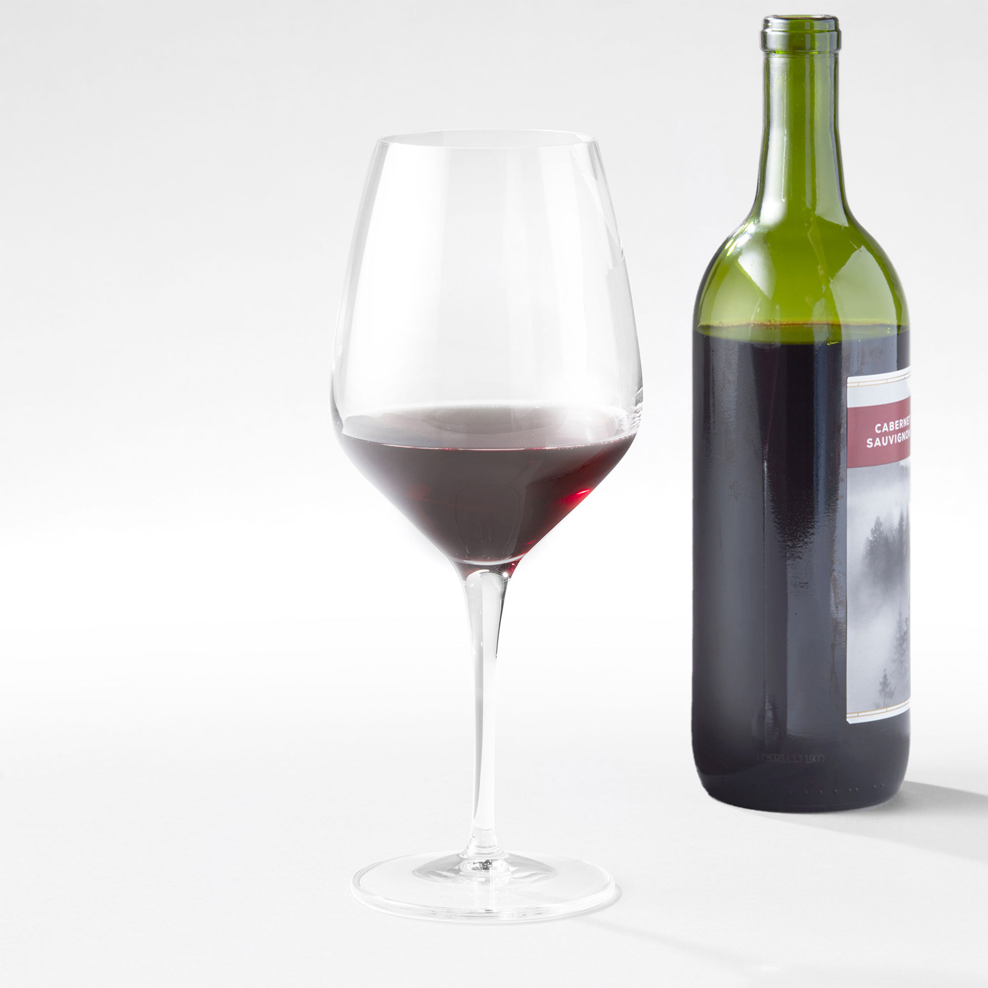
After- shows scale, lighting and prop liquid allows product detail to be clearly seen
Before & After of iridescent drink ware - hover over the images for more details
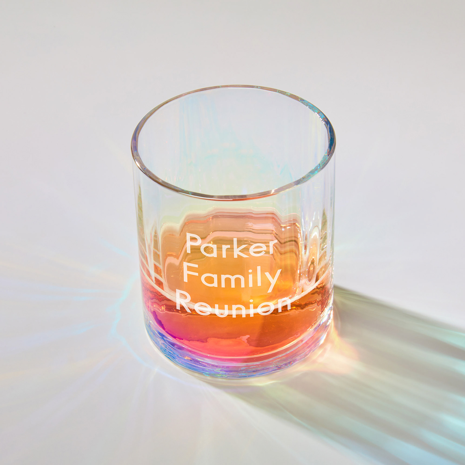
Before - really cool, artsy look but it did not look like any other imagery
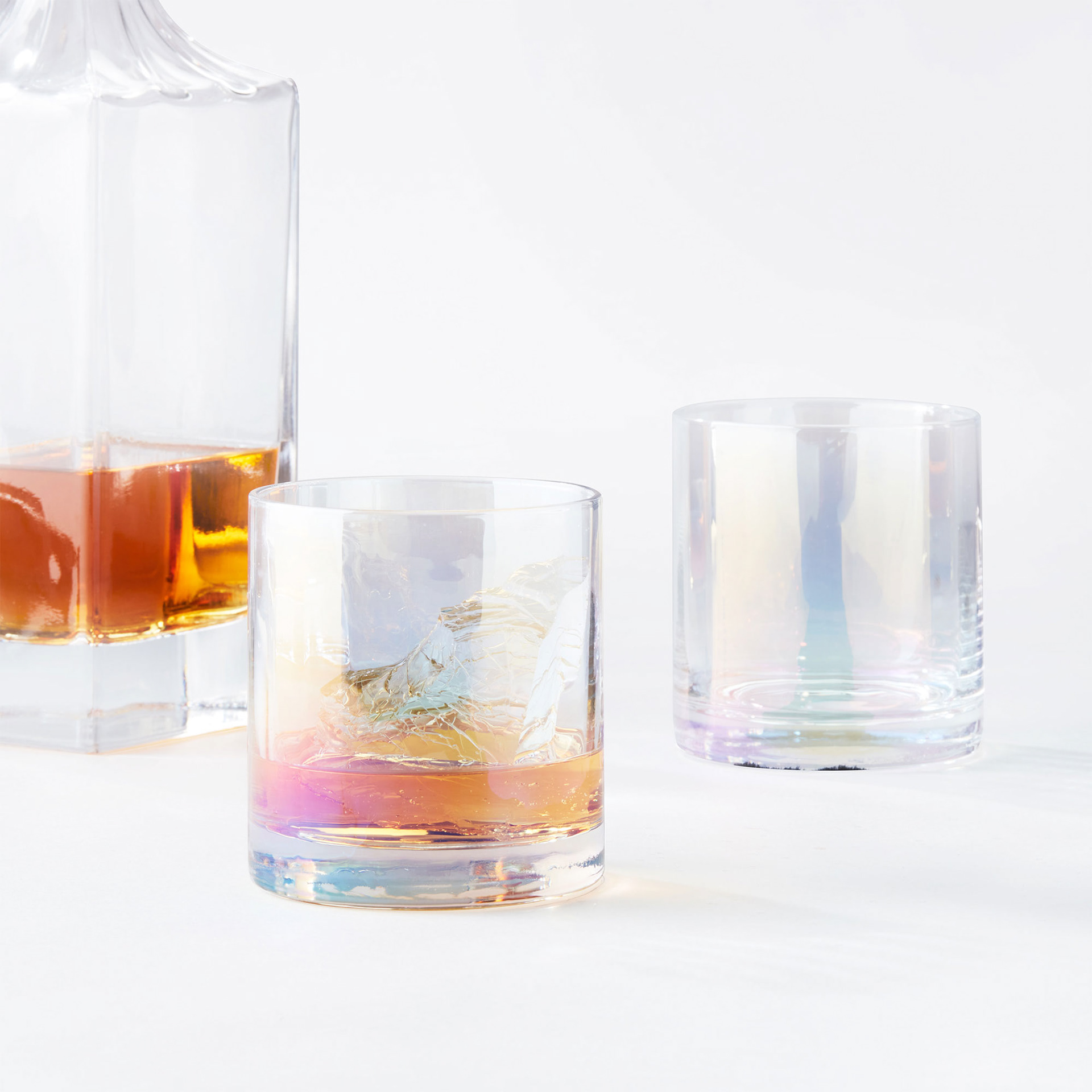
After - lighting more consistent with a decanter for scale
Before & After of iridescent drink ware - hover over the images for more details
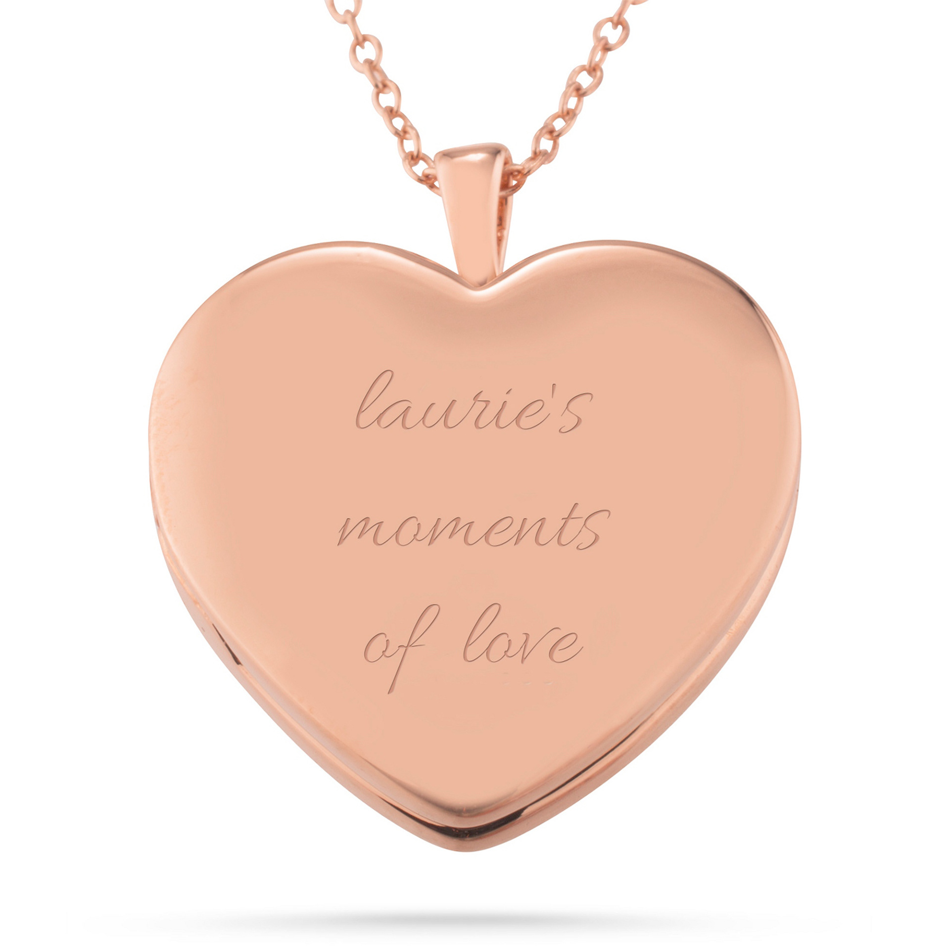
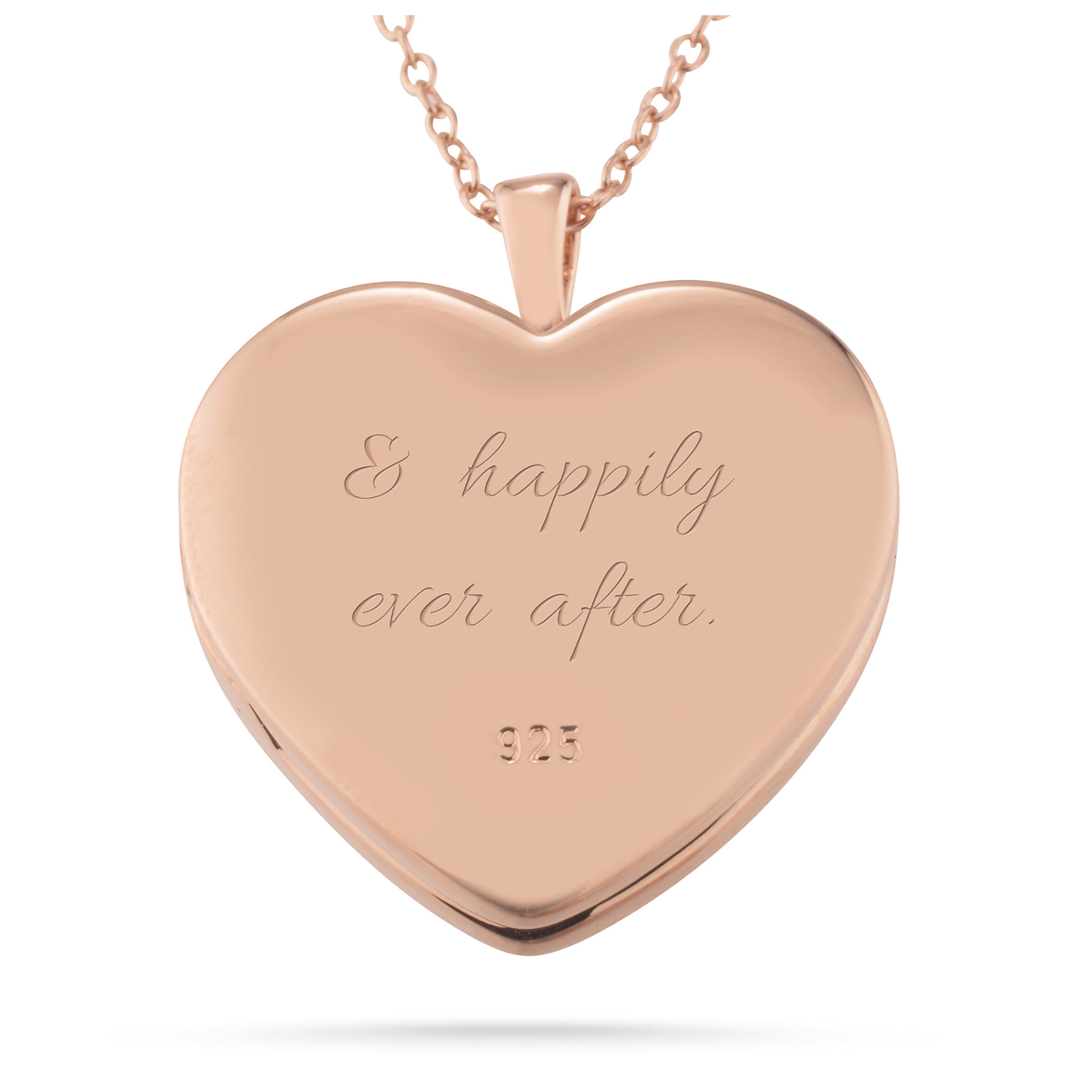
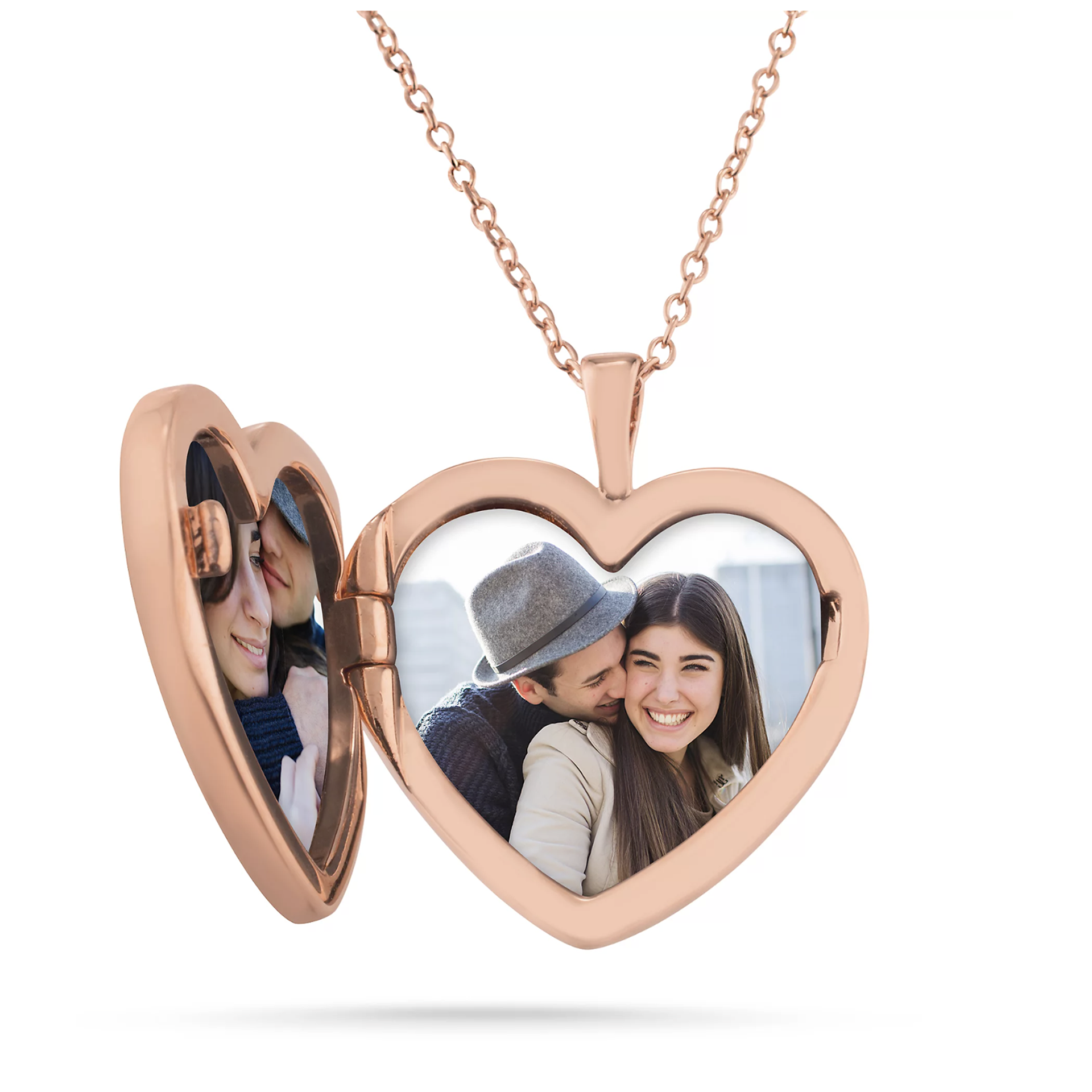
Before - Inconsistent color, extremely tight crop, lighting doesn't show the lockets' curves, and there is an odd shadow
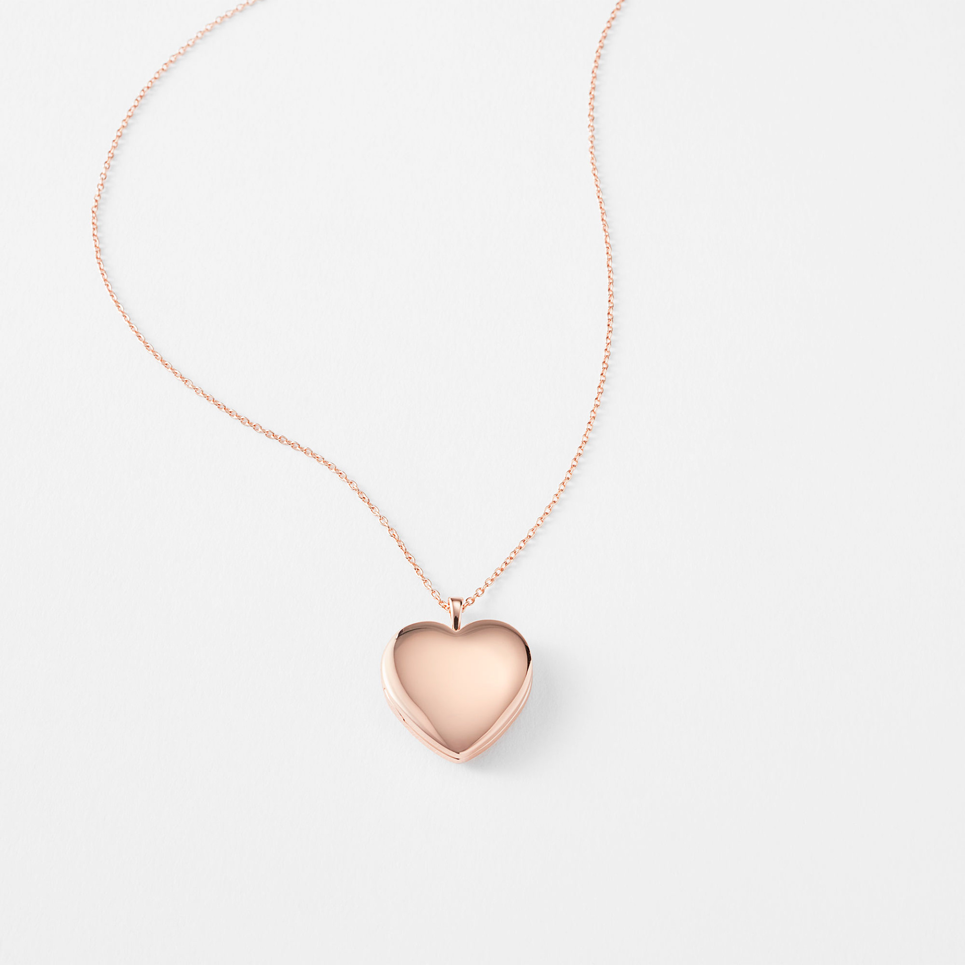
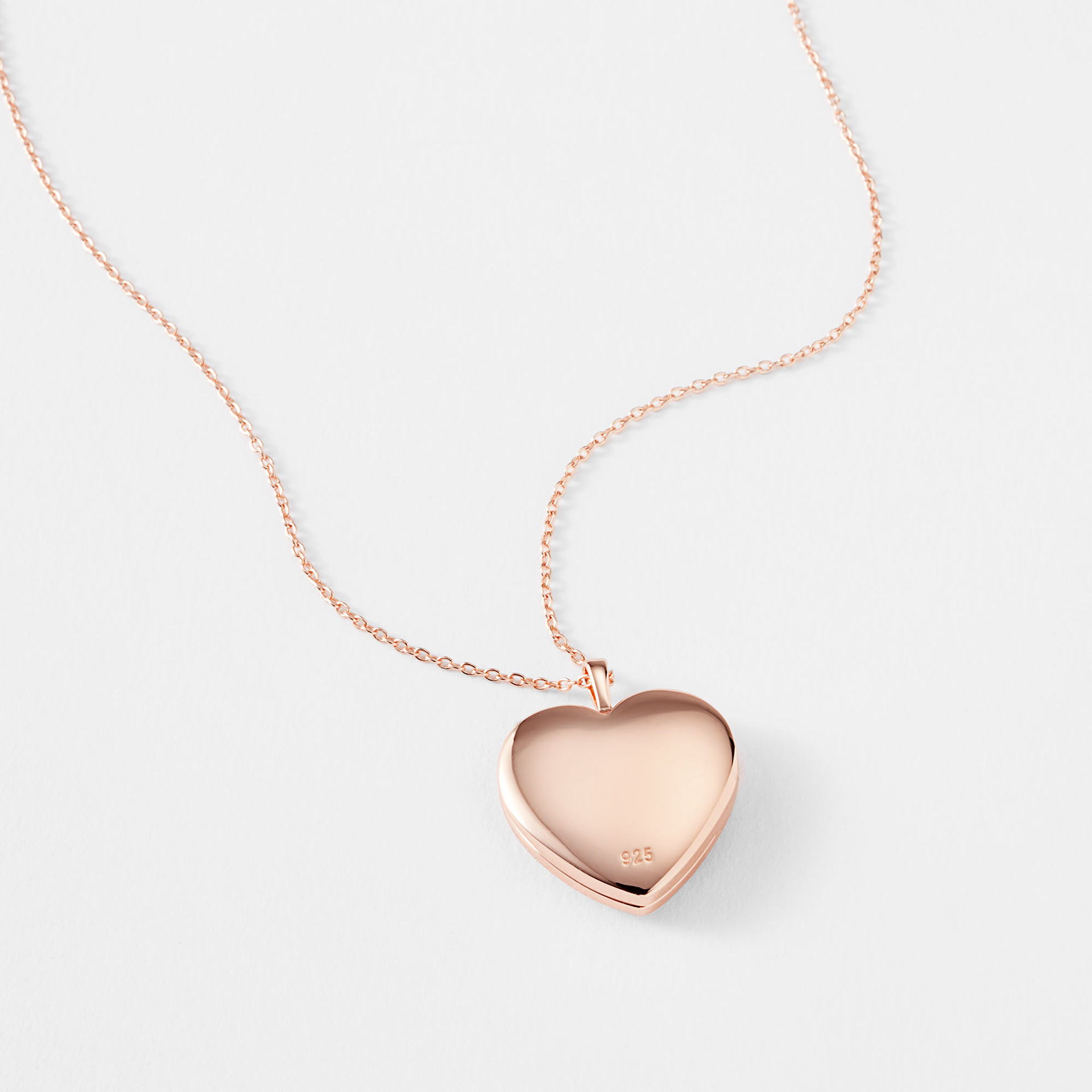
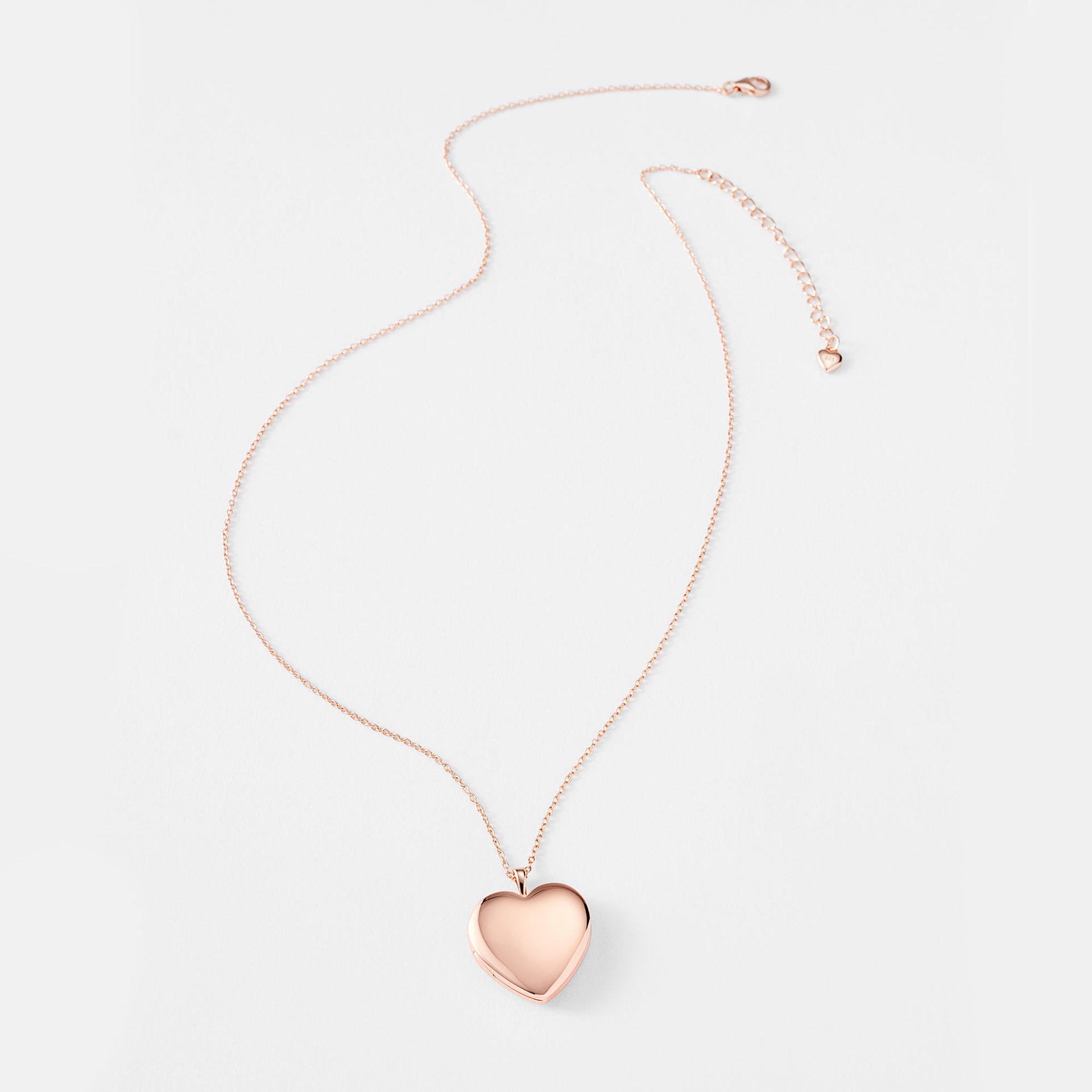
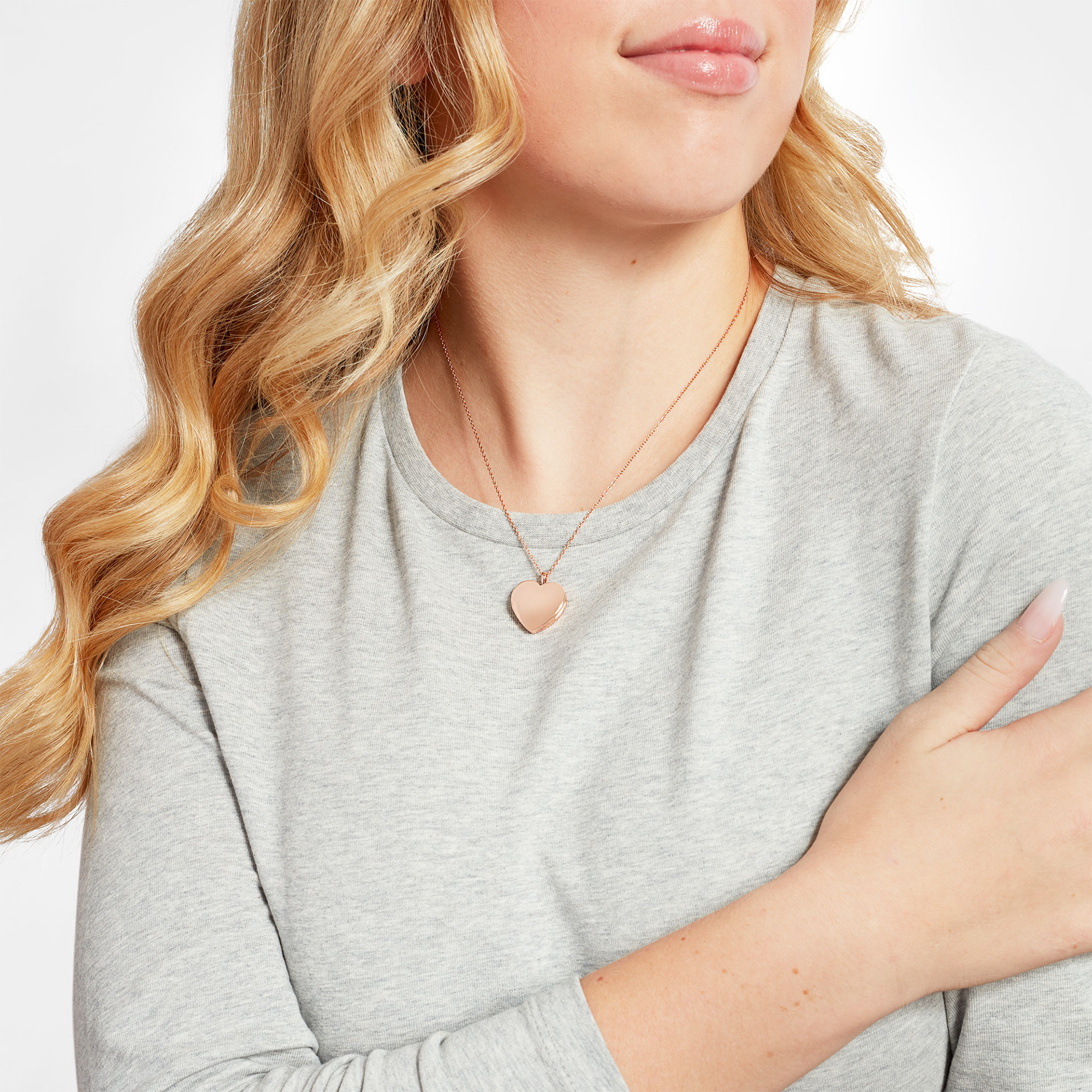
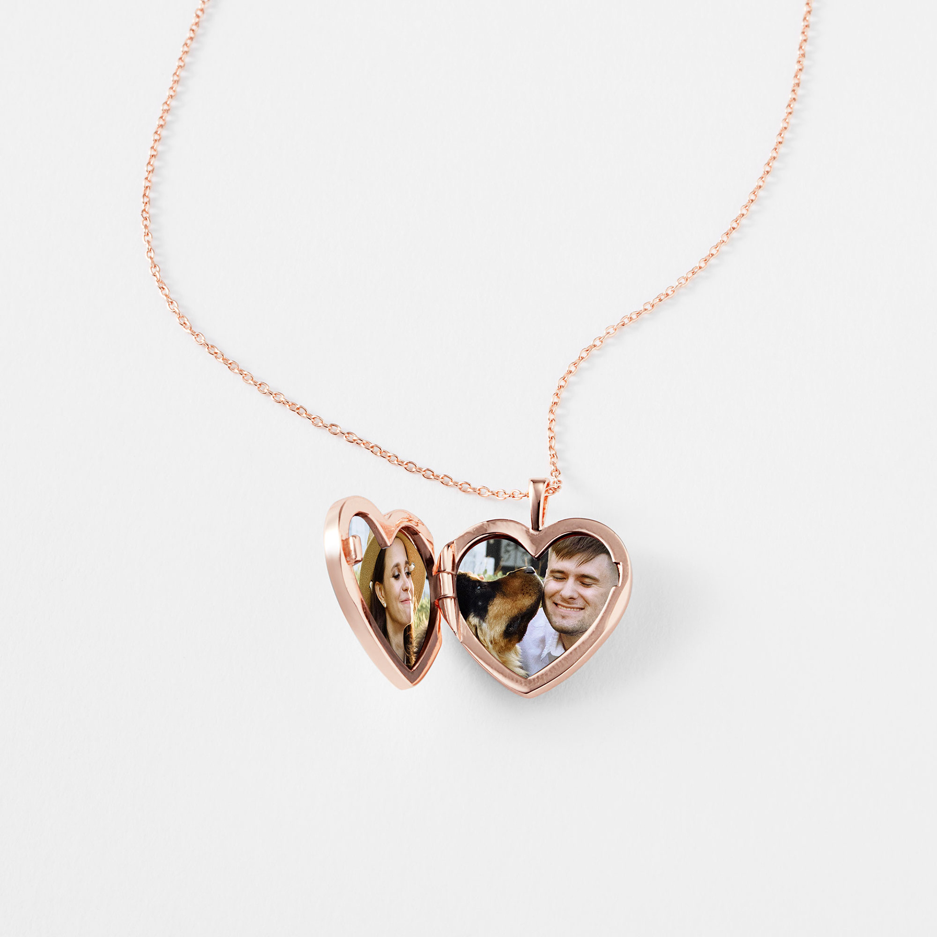
After - Color is consistent, lighting shows product curvature, the composition is more relaxed and shows full chain, and a model shot for scale helps with size.
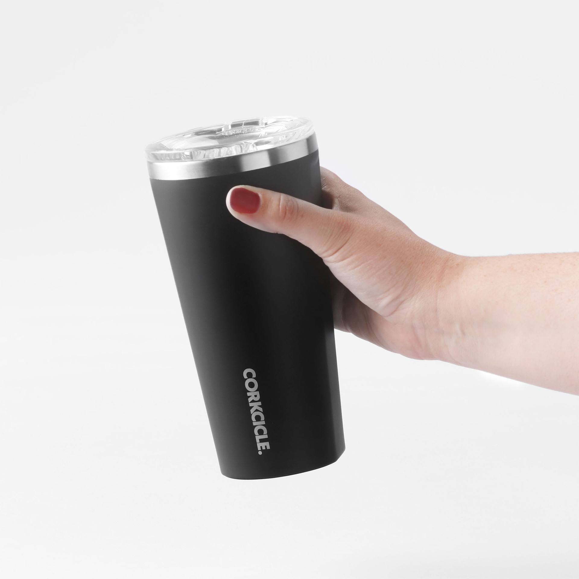
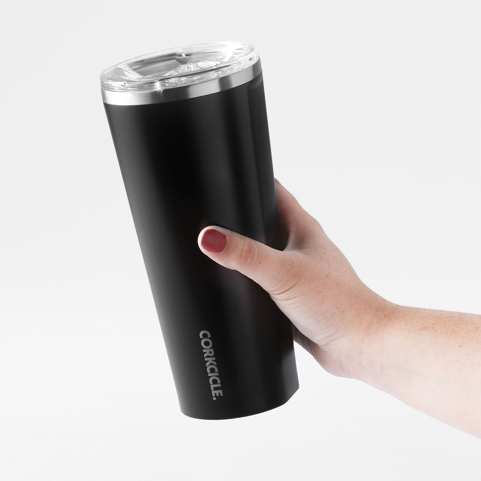
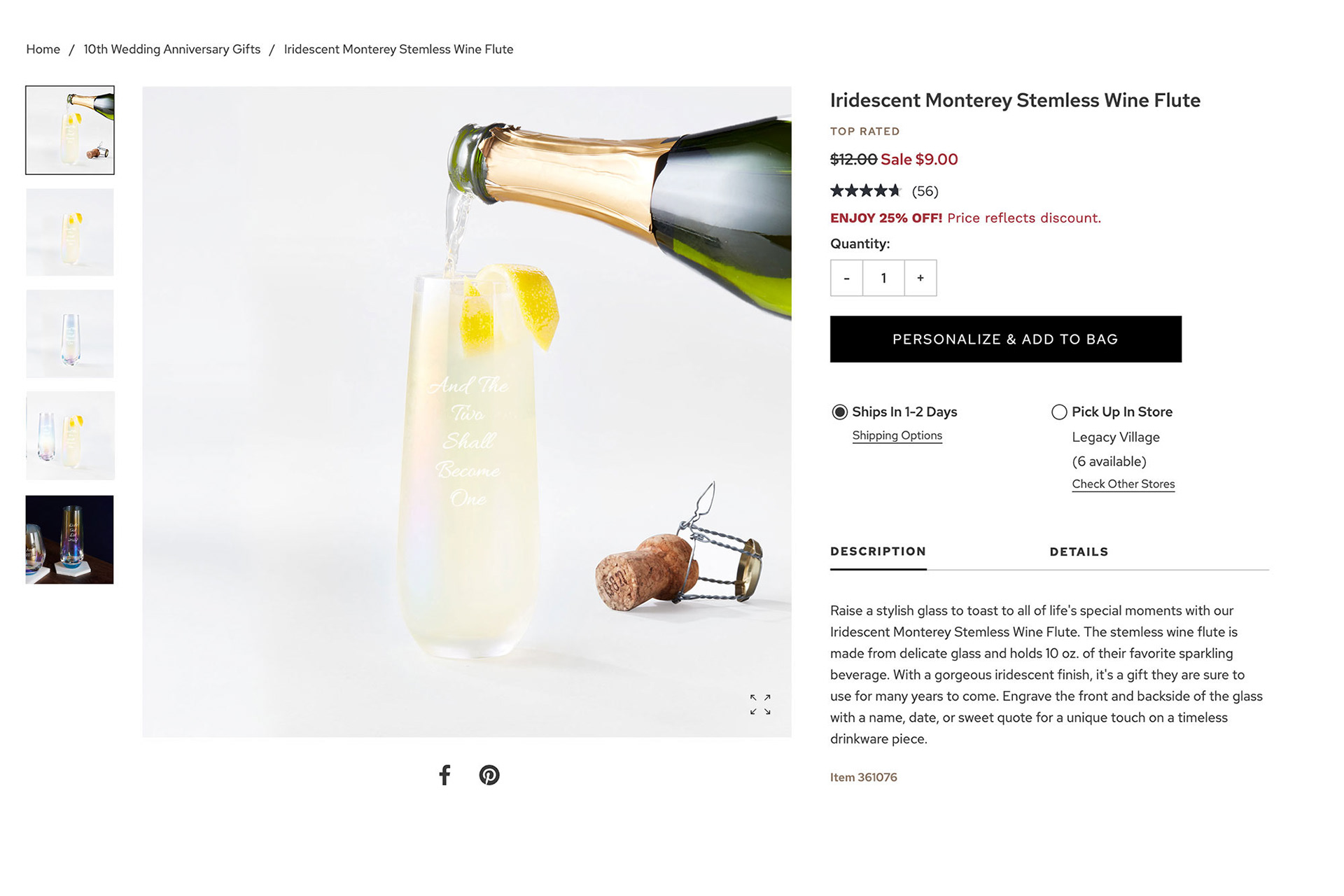
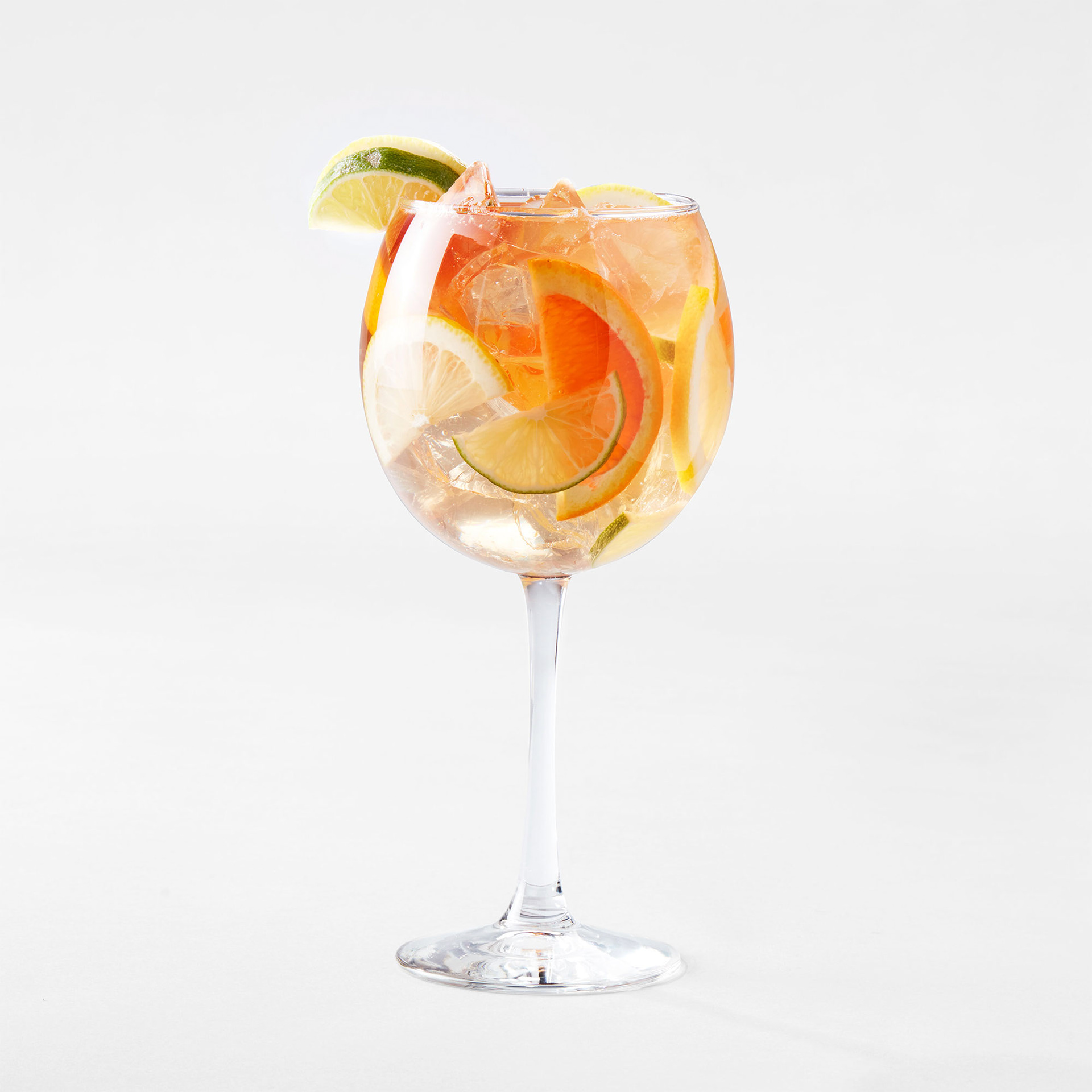
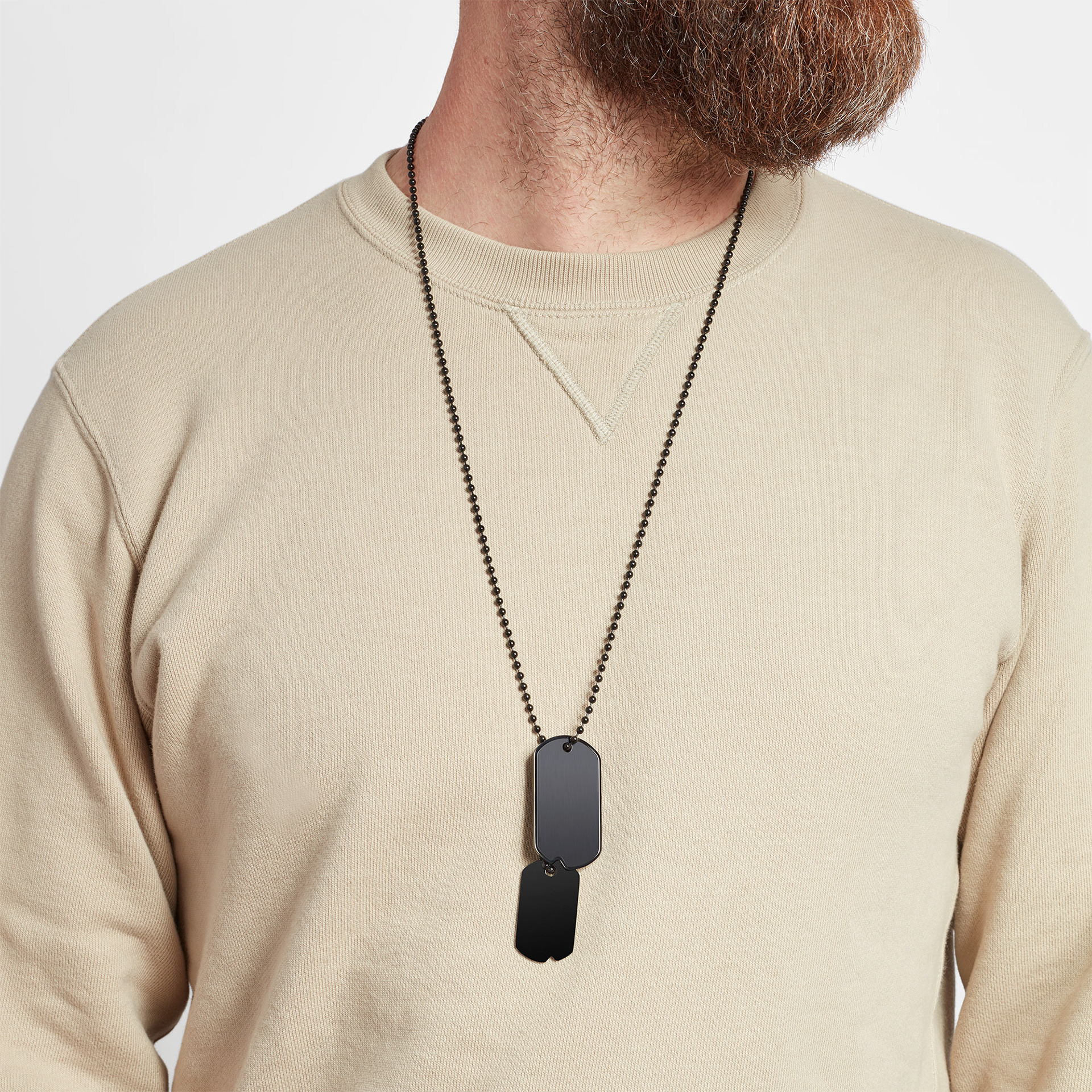
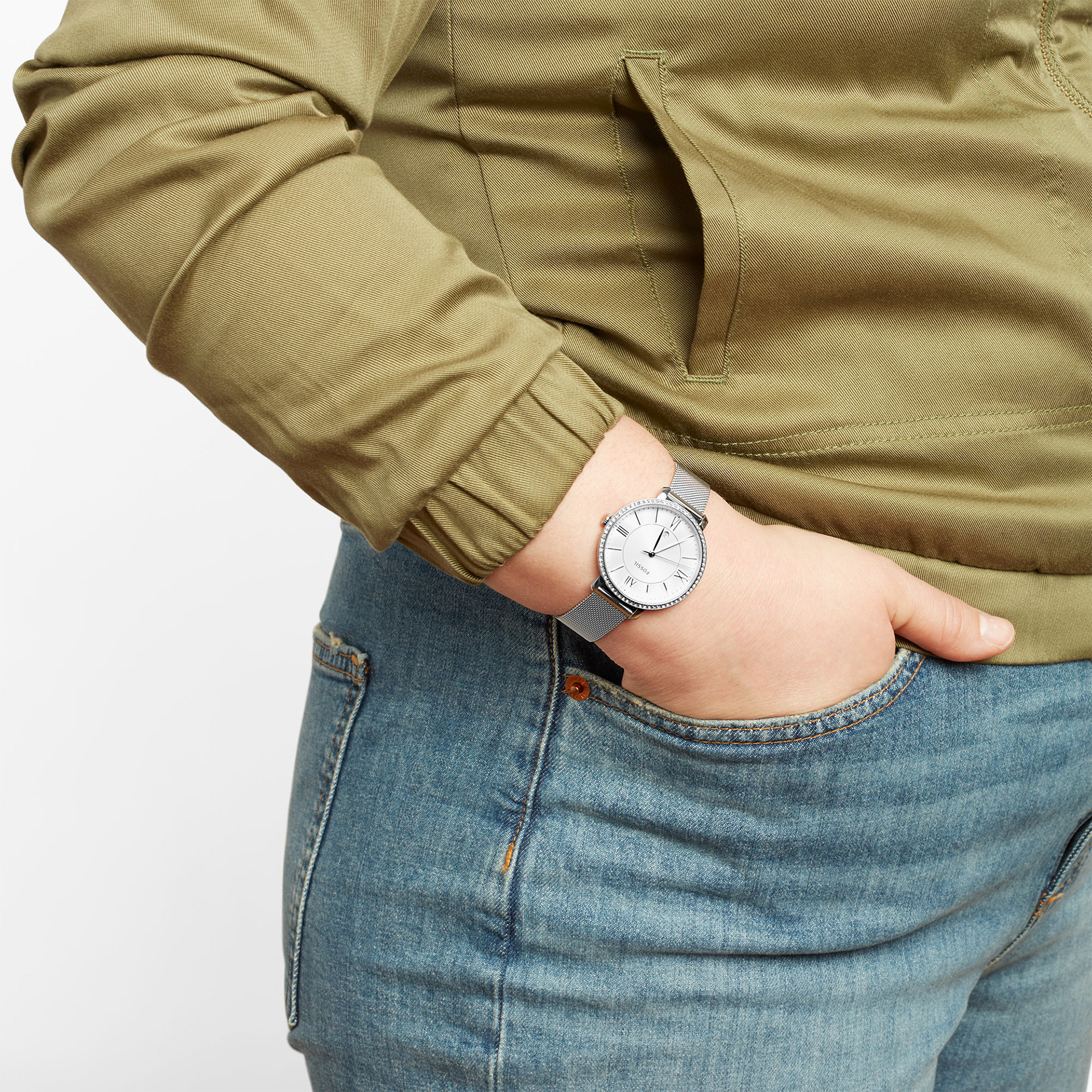
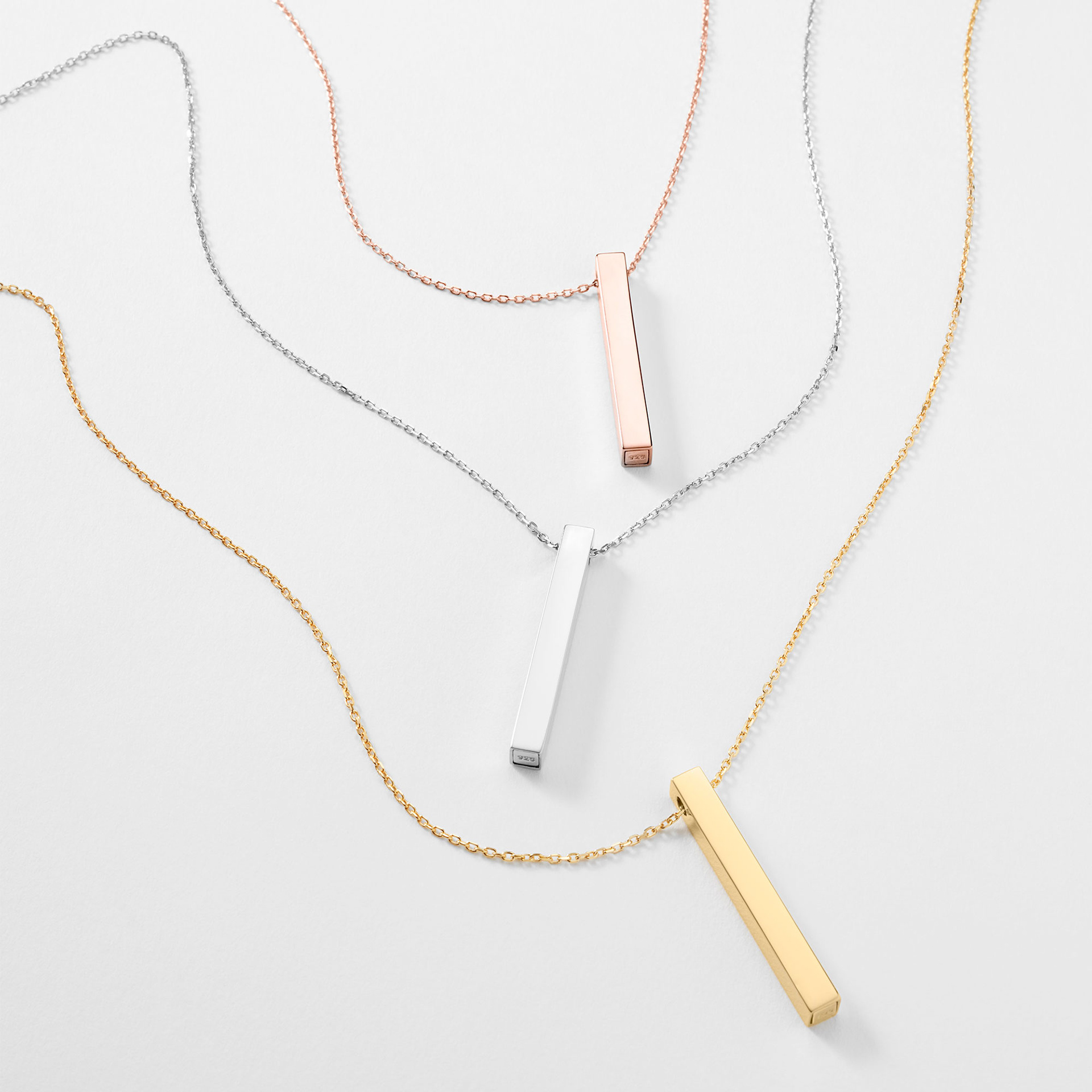
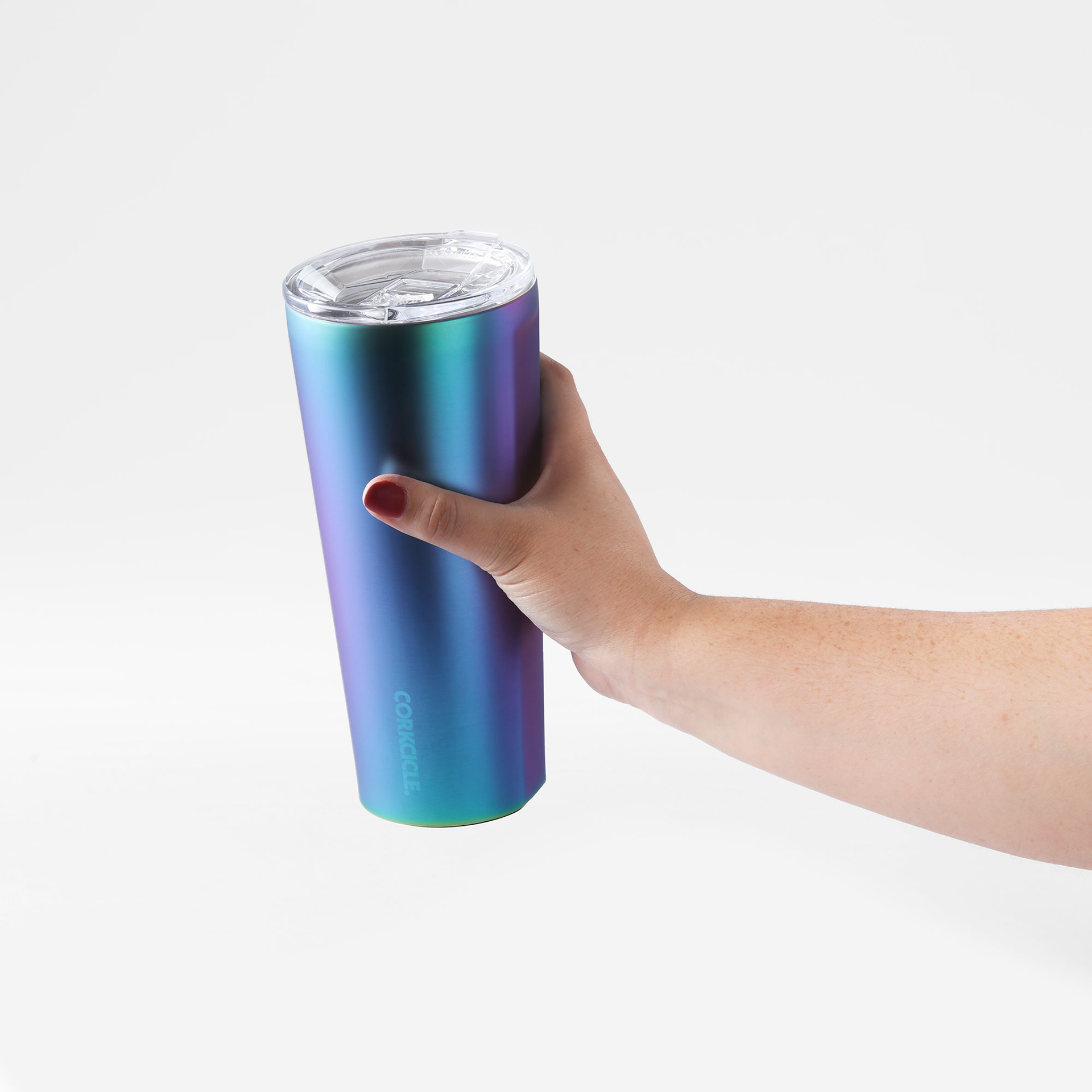
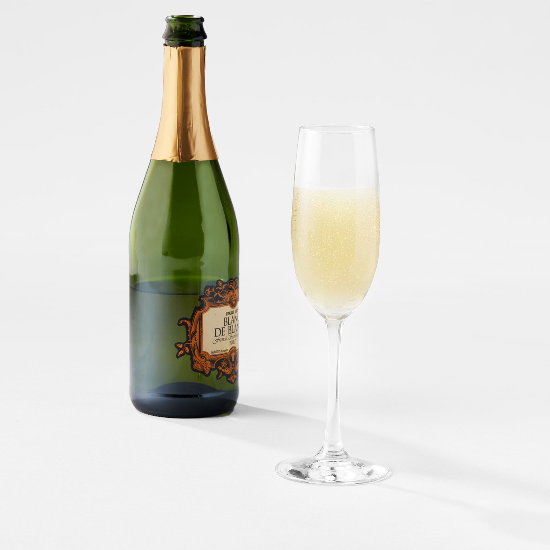
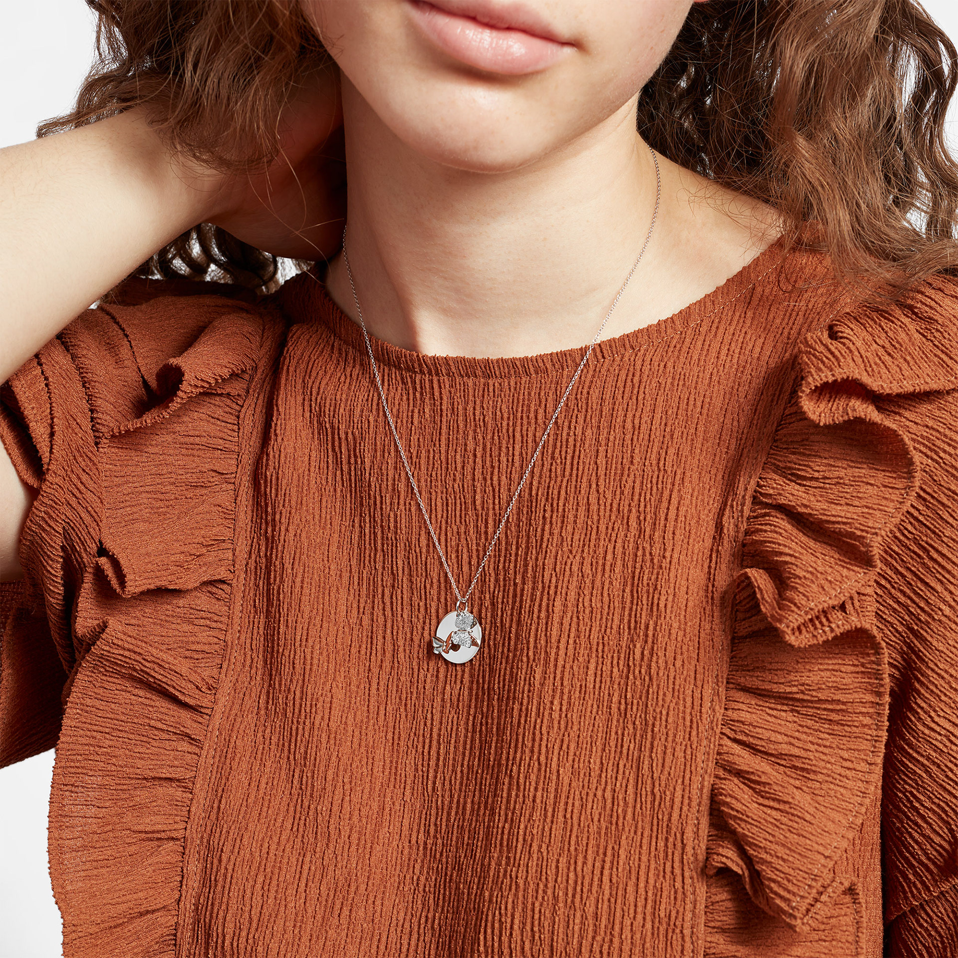
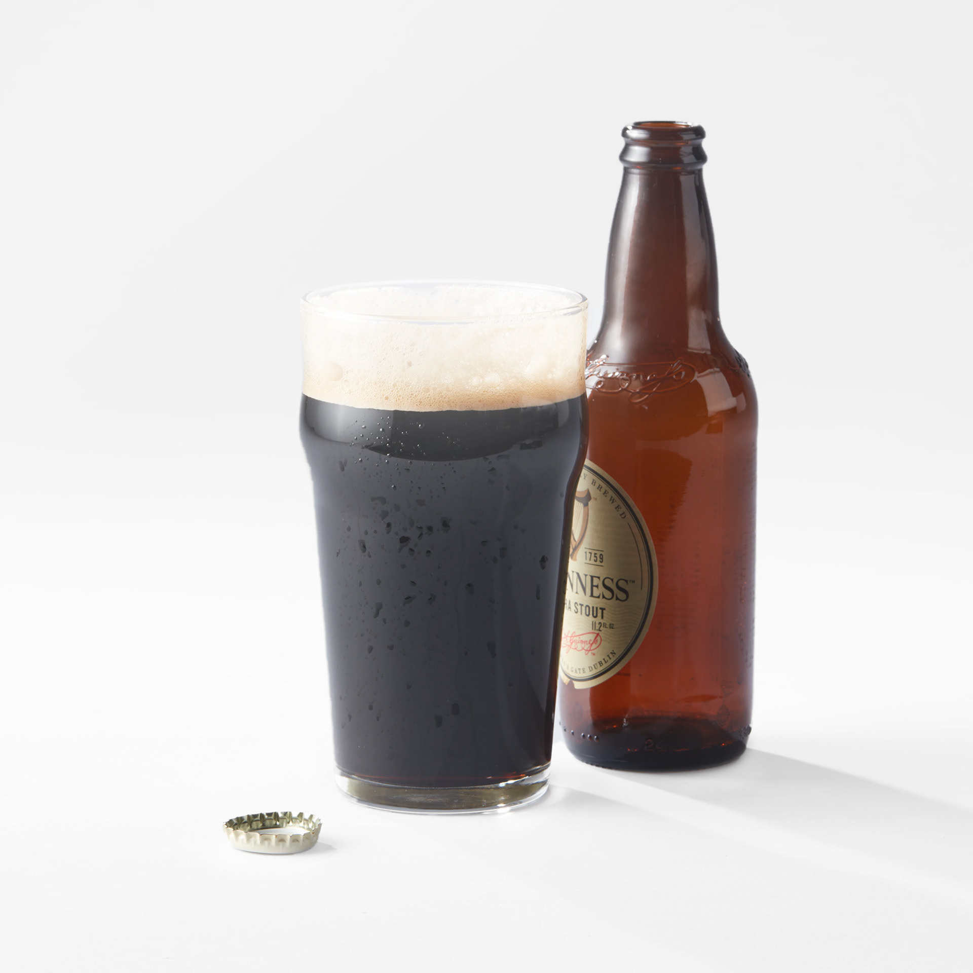
Samples of some completed imagery. The work primarily focused on drink ware and jewelry initially.
Team Credits
Art Direction: Jen Langman
Studios: TRG Multimedia, KP Photo
In-House Team: Zane Lutz, Paul Levar
Studios: TRG Multimedia, KP Photo
In-House Team: Zane Lutz, Paul Levar